This past week, I had the privilege to be involved with the Phizzpop Design Challenge in Austin. I was called in by Chris Bernard as a technical mentor to the contestants who needed help and to help him run things on the night of the presentations.
What is the Phizzpop Design Challenge?
Let me back up here and explain what the Phizzpop Design Challenge is. Phizzpop, the new Microsoft center for design excellence, sponsored a design challenge focused on the designer/developer workflow while solving an experience design problem. They invited a number of different design firms to compete in regional competitions, 36 teams total took them up on the challenge. The winners of the regional challenges go to South by Southwest to have a showdown to determine the national winner. The challenge itself was send at least 2 but no more than 3 of your “A” team to design and build a solution for a problem in 2.5 days. At the end of that they publicly show their solution in front of a large crowd and importantly a panel of judges. To help them out, there was a 2 day training class in Expression Design, Expression Blend, WPF, Silverlight and so on. Additionally, they provided me and a number of other resources from a technical end. The goal was to make sure that the technologies were not a blocking issue to success for the teams. I was completely amazed at the mad design skills that each of the teams brought to the table. Those of you who know me know that I couldn’t design a handkerchief so my opinion is not the one that matters. π However, Chris Bernard and everyone who saw the finished products were really impressed with the quality and completeness of the designs across the board.
What was the design problem?
Each of the regional events had their own design problem. I really liked the one in Austin as I really enjoy independent films and social media. There’s an independent film distributor called Microcinema out of Houston that does local viewings/film festivals called Independent Exposure around the nation at coffee shops and the like. They want to reach out beyond their local viewings which are expensive to set up, market and run using all the technologies that are available. There were three personas that were involved including a college film student, an artsy non-technical wanna-be bohemian who’s married to a doctor and a social media junkie/job recruiter. The designs had to satisfy all three of the personas to be complete.
The teams were judged equally on:
– Satisfaction of Constituent Needs: How well does the needs of the constituencies as defined by the profile? Is the experience appropriate for the audience? How elegant is the experience?
– Satisfaction of the Market: How well does the solution address the market needs? Will the solution work across all of the identified constituencies?
– Uniqueness of the solution: Is the solution unique, differentiated and defensible?
– Technical Excellence: Was the team able to build a working solution (however limited), or is it purely a scripted prototype?
– Aesthetics: How visually appealing is the solution?
There were also bonus points available for integrating with the Live services and overall creativity.
Who were the teams?
In the order that they presented their challenges:
Telligent – The guys that produced Community Server and they’ve recently started up a real design practice. They obviously have great experience in web applications, social media but I hadn’t seen a ton of their design work outside of their templates for Community Server. I have always liked their templates that are on top of Community Server – in fact, I’m really hoping that they will leverage that same experience to design some templates for Sharepoint too.
Frog – The largest and most established firm in the competition and clearly the favorites. These guys being involved proved interesting because many of the other firms were composed of graduates of Frog and it really raised the level of competition.
Projekt202 – Young and hungry firm. I had the least amount of interaction with these guys but they were fantastic.
Poplabs – These guys are are media experts that really brought a different perspective to the table. It was unfortunate that they were plagued by hardware problems. It didn’t help that this was the first of these type of challenges that they had been in. They had some great ideas.
Thirteen23 – The firm that was at MIX and build the application called mixME in 8 hours with many of the same team members. Check it out, it’s a fantastic showcase. I knew that they were going to bring their “A” game and had high hopes for them.
Neudesic – I heard about this firm literally last week when I found out that Sam Gentile had joined them to help them run their connected systems practice. But I didn’t know that they had a design practice, in fact a lot of people didn’t know that as they started their design wing 6 months ago.
How did I help?
Phil Wheat and I were onsite during the entire build process for the teams as technical resources to make sure that the technology was not the blocking issue. We had a number of interesting questions that were tossed out over the 2.5 days that ranged from relatively basic (Very few of these) to “holy cow, what am I a ninja?” hard technical questions. The best ones were the ones where they were butting up against the technical limitations of the technologies involved. My favorite question was one where they were trying to dynamically set the ZIndex of a control. We scratched our head over this one for a while. I called in favors from a number of guys ranging from Scott Barnes to Jeff Blankenburg who looked at the code remotely and scratched their heads over it as well. It looked right and it wasn’t throwing an exception but it wasn’t doing the right thing.
this.SetValue<double>(Canvas.ZIndexProperty, ZIndex);
The issue, as one of the contestants from another team figured out and revealed in an true spirit of sportsmanship, the issue was that it needed to be setting an int rather than a double.
this.SetValue<int>(Canvas.ZIndexProperty, ZIndex);
I thought that this was wild and broken that it doesn’t throw an exception when you pass in the wrong type like that.
There were other questions like how to do a particular type of animation. When doing logic, XAML and the like – I knew how to help with most of those. I had an issue, however, when they started getting fancy with the animations, like trying to use Ease Splines. In that case, I had to call in the expert help of the editor for Phizzpop, Don Burnett. At one point, I had Don on speaker phone and watching what we were doing with LiveMeeting and giving us direction. That was cool and I learned an amazing amount. Don helped a ton throughout the couple of days.
How’d the build go?
All 6 teams brought fantastic ideas to the table. There were obvious ideas that all of the teams centered around with integration into current social media like Twitter, Flickr and FaceBook. I was really impressed by some of the originality shown by some of these ideas like Neudesic allowing Facebook members to share movies with their other friends. Several of the firms had the idea to bring in time-lined comments from Twitter.
The different firms displayed different ways of working. I actually didn’t even see Frog or Projekt202 until the night of the challenge as they just worked out their home office. They were allowed to ask their other team members for ideas on the design but not for help with the implementation. I saw Thirteen23 on the first day as we had a number of assets that they were allowed to use, like videos and images from Microcinema that they needed to copy. This was really the only downside of the whole experience. I would have loved to have seen the process that these fantastic design firms used. I did get to watch several of the firms.
Neudesic actually worked out of the room that I was hanging out at to be available the entire time. They had three team members, two devs and a pure designer. It was great to watch how cohesive they worked together. For the 2.5 day build, they set up a team site and source control. They almost did TDD, Continuous Integration and everything but they quickly realized that they were not going to be maintaining this code beyond Friday because whatever they build would be considered a prototype and would be tossed if they ever went forward with it. They sat down and started hammering out a design and as soon as they identified components that they were sure that they were going to need, one of their team started building those. The others kept on until they knew the services that they needed and the other dev started on those. The designer started creating assets and they started sticking those assets on the components and then stared wiring those components up to services. It was fabulous to watch. They had, hands down, the most completely implemented and least vaporware solution that was presented. However, it was a design contest and their design was good but it wasn’t the best. I, personally, have a tremendous amount of respect for the Neudesic team and feel comfortable recommending them as the UI team for anyone. The questions that they asked were definitely cutting edge and showed they were pushing the technologies (Silverlight 2.0, WCF and so on) to the limit. The only one that they were really stumped on was a cross domain issue where they were calling services on a different domain which is not allowed in the current release. It’s coming, but not hear yet.
I also got to see Telligent a few times when they came in to ask questions and get a change of scenery from their hotel room that they were working out of. The questions that they were asking were where they were pushing the limits of Silverlight and they just needed clarification on where the boundaries were.
I spend most of my time with Poplabs. As I said, they had a lot of hardware issues. They had two machines, a mac and a dell, just die on them. They had issues with installation of the software needed onto a third box. And so on and so forth. They finally really got to the implementation on Friday morning. At 4:00, they realized that what they had was really not going to get the job done. Toya D., their designer/dev, took her box off to the venue and sat down to start over from scratch. In 3 hours, she threw together a fantastic working demo that was at least as much of a working demo as some of the other teams. Her team mates sat down and started working on a slideshow for the judges to show the rest of their idea that wasn’t going to be completed. It turned out that all of the teams, besides Neudesic, had this type of an presentation – some implementation and a lot of presentation. I was really impressed with her skills from a design and implementation perspective – especially given that she really cranked out the final product in about 3 hours.
How was the Party?
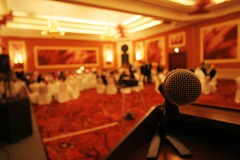
For the presentation portion of the contest, Chris threw a heck of a party at J Black’s. First of all, the food and drink was fantastic. There were 3 HD projectors showing off the fantastic designs that every came up with. There was a DJ with a pretty cool rig. It was an Ion IDJ iPOD DJ Mixer. He had two iPod’s hooked up with all of his music and did the whole party from there.
The official program started with presentation from Steven P. Anderson about what designers are and what they do. He really did a fantastic job of setting the stage and helping the audience, not all of whom were familiar with the practice of design, understand the underpinnings behind the competition.
Then Chris introduced the judges:
Erica O’Grady – Social media consultant, designer/developer in her own right, creativity coach and all round fun gal to hang out with.
Norm Cox – Design legend. Started with Xerox and has run his own firm since 1982.
Todd Wilkins – Design Researcher with Adaptive Path. He was a last minute serendipity. One of the judges had recused themselves as they personally knew the members on one of the teams and out of the blue Chris found out that Todd had just, and by just I mean on the same day as the competition, moved to Austin from San Francisco.
Then Chris introduced the design problem and we got started showing the final products in the order above. There were a few gut check type technical problems, like one of the teams not having a Firewire cable with them and their entire solution on their external drive that they couldn’t access without one. Fortunately, we found a USB 2.0 and a Firewire cable for them to try. Other than minor issues like that, all of the presentations went well.
What was the result?
The three judges all came out and said flattering things about all of the teams. In fact they said that none of the judges completely agreed on the top 3 and that every firm was in at least one of the judges top 3. That’s an impressive fact and really goes to show that all of the teams did a great job.
However, only one team can win. In something of an upset, Thirteen23 came out on top over the top of the some of the larger firms. They brought together design, function and implementation not only with the expected technologies but in their spare time they threw up a live service and invited all of the contestants to hit it with their iPhones to watch a movie as well. It was really impressive. They are supposed to work with Chris this week to get their implementation posted to the Phizzpop gallery and I’m sure that they will show it off in their labs as soon as they get done celebrating their awesome victory.
Who’s going to the finals?
AQKA, San Francisco Winner
Create the Group, New York Winner
Clarity Consulting, Chicago Winner
Cynergy Systems, Los Angeles Winner
Outright Interactive, Boston Winner
Thirteen23, Austin Winner
Wanna keep up?
First, check out Chris Bernard‘s blog as he’s posting a lot of the follow-up information there.
Second, go out to Phizzpop and register a profile to get notifications for the upcoming challenge and other great events that are popping up around the nation.
Last, if you possibly can you should register and attend SXSW to watch the big showdown in person.