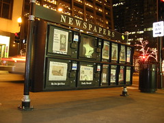
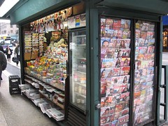
 I’ve come to realize that many web designers don’t understand what “Above the Fold” and how it really should be used. Above the Fold is an old print newspaper layout term for what’s on the top part of the page, the part that is displayed in the window at the newspaper stand. In web design, the term is used for the bits that the user can see without having to scroll. I’ve talked and ranted about this before as It’s point number 23 in 32 ways to keep your blog from sucking…
<update>It was brought to my attention that it’s often not a web designer but rather an Information Architect or a Developer who is updating the layout on the page. Completely agreed and this is yet another reason that you should look for competent web designers for the layout and design of your page.</update>
What’s bringing it up now is that CX Partners recently blogged about The myth of the page fold: evidence from user testing | cxpartners and it concerned me a little. CX Partners does a lot of user testing and one of the things that they have tested for is whether or not the “Fold” mattered to users and out of 800 users, only 3 were unable to find content because they would have to scroll to find it. They are right, users are used to scrolling and are willing to do so if they know that there’s more content below. We just need to give them visual hints that there is more content that they will have to scroll to see. What they are trying to fight is the urge to put all of the content or at least all of the *important* content Above the Fold and design pages so that users do have to scroll. I’m on board with that fight. Cramming all of the content into cramped margins and smashing things together just so that it can be seen without scrolling is horrible design.
Here’s the part that concerns me as an old school print layout guy. There’s a fundamental miss on what the “Above the Fold” content is supposed to be used for in your layout whether it’s print or web design.
How does print layout treat above the fold?
The above the fold content is not meant to be the meat of the content or really even the most important content. It’s meant to be eye catching. It’s the lure for people to pick up the paper or magazine.
 When thinking about the fold in a newspaper, think about the old school newspaper dispenser with the top half of the top page displayed in the little window. There is a deliberate attempt to put a catchy photo and headline in that window so people buy the paper. Is that the best thing in the paper, not even close. That’s the picture that’s going to look good on someone’s coffee table when they toss down the newspaper.
 Or better, think about the magazine stand and how there are potentially hundreds of magazines there and you need for yours to stand out enough that people will buy it. Think this through – what can they see in the magazine stand? Typically they can see the top edge of the magazine and part of the picture. I was amazed once when I was talking to a freelance sports photographer who told me that he’d net $40k-$60k for one photo if he could land the cover picture on Sports Illustrated. But it makes a ton of sense. This concept of trying to stand out on just a headline and a photo is not lost on the smart people at Sports Illustrated. The right picture could make far more than $40k worth of a difference on the stand.
How does this apply to web design?
Honestly, it’s the same exact concept. The fold or scroll line is the area of the page that people can see without having to scroll down the page. This area needs to catch people’s attention correctly because they may only be on your page for a few seconds. If you look at the statistics on any site that gets a decent amount of traffic and the average page view length is measured in seconds, not minutes.
When people are browsing through and they get a link from another site or from a search engine, what’s the first thing that they see? Imagine that as if they are glancing past your page among the potentially hundreds of others that they are looking past which is really not that much of a stretch because they are looking to see which pages are more likely to fit their needs than others. They may not be paying for your content but they are investing their time.
The problems come in two sizes. First, there are designs that try to shove as much content as they can into that above the fold area because there’s an assumption that if it’s not there, their users won’t see it. Second, there are other designs that completely shun the idea of scrolling and end up with these horrid wizard style pages where the user has to click through to see the next page and the next page and so on. Either of these are poor choices.
Back to the article for a moment – I really liked CX Partners’s “Design tips to encourage scrolling”. What was missing is the “How to hook them and keep them” bit.
Let’s look at Jeff Blankenburg’s blog for a good reference here.
You know exactly what you are going to get on his page. The disk in the middle, which is what most people see first cycles through all of the social networks that he frequents. The tweets across the top express his last several publically blasted thoughts while the little bird that flies around them draws eyeballs to them. The menu shows you that he’s delivering Code and Slides through this blog in addition to other posts. The RSS tag that hangs down and swings a little definitely captures the attention and draws people to subscribe. Finally, the title of the blog and the first blog post start drawing eyes down the page to see the meat of the content. But what real content is above the fold on Jeff’s blog? Honestly, there’s none. All of the real content is below the fold so the user has to scroll for it. Going back to the CX Partners post, that’s fine. Users know how to and are willing to scroll for content if they find the page interesting. The *only* thing that I dislike about his header is that it’s a fairly large chunk that takes 3-5 seconds to load the first time. This is a killer if the use
r is only on the page for 3 seconds.
Another great example is any Amazon product page. They have the picture of the product, average user rating and price right at the top. The product detail, related products, the actual reviews and all of the rest of the content is below the scroll line. Obviously, it’s successful for them.
Wrapping up…
Above the Fold is widely miss-understood. You need to realize that this critical section of the page is not about shoving as much content as you can the user. It’s about effectively giving the “Elevator” pitch on your site and getting that longer look that will likely involve scrolling down to see the real content.
Guard the above the fold content and keep it to the essential bits that will tell the user what your site is about rather than trying to give them everything in one big drink from the fire hose. Whenever anyone talks to you about moving a certain section of content above the fold, turn the question on them by asking them how that keeps people on the site over all.
